Results
Check-in time reduced by 2 minutes per person.
2 Min
Increased customers by 31% per event, based on auto follow up feature.
+31%
Visitor Checkin
- Client
Realtor
- Web Site
Coming Soon
- Role
UX/UI, Branding
Overview
I was hired by a team of realtors to take their basic idea of an app that would solve a problem related to visitors checking-in during their open house events. For this project, I did the branding of the app and the website, created a design system and also worked as a UX/UI Designer I took on the tasks of Competitive research, User flows, User Research, Information Architecture, and High fidelity Wireframing/Design.
Problem
A team of realtors were facing a problem managing their visitors check-in. This was a problem that occured during their open house events. While the reator would be busy communicating with potential clients, it would get difficult for the realtor to get every visitor to check-in. This happened because of 2 reasons. (1) Visitors hesitated spending time writing and sharing information (2) Realtor had to manage and transfer potential cutomers data from paper to computer
Challanges
- Preventing visitors information from being exposed to the next visitor.
- Keeping visitors engaged and not overwhelm them with questions.
- Getting feedback from visitors upon exit.
- Connect with the visitor through the app.
Goals
- Create an easy check-in process
- Create a brand and a design system.
- Design the app and a full insight dashboard.
- Design product's website.
Objective
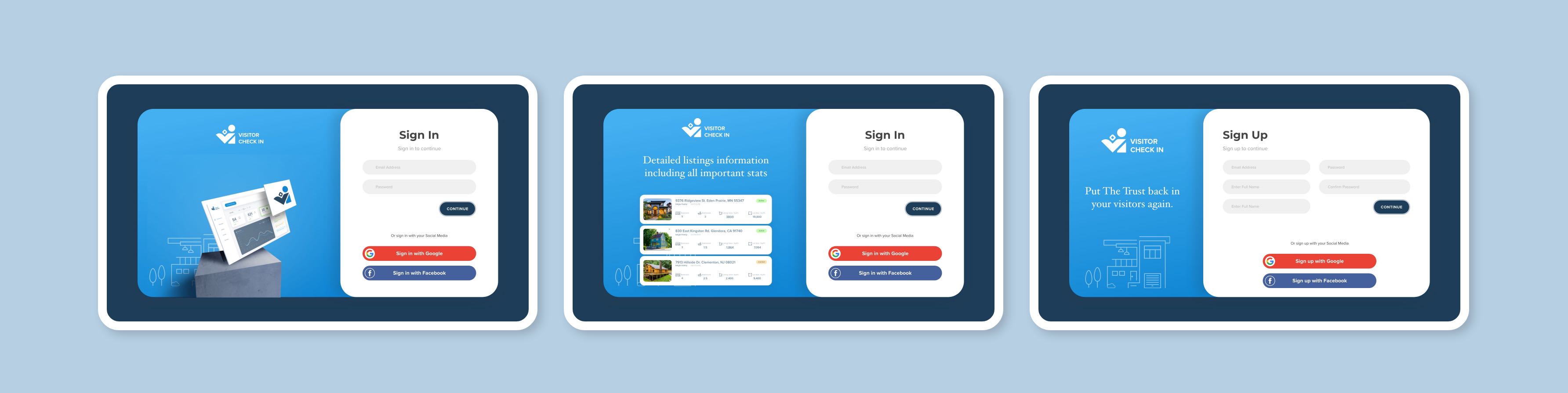
Visitors did not feel comfortable sharing personal information through the app. To obtain trust and confidence, we had to choose a specific color palette.
Choice
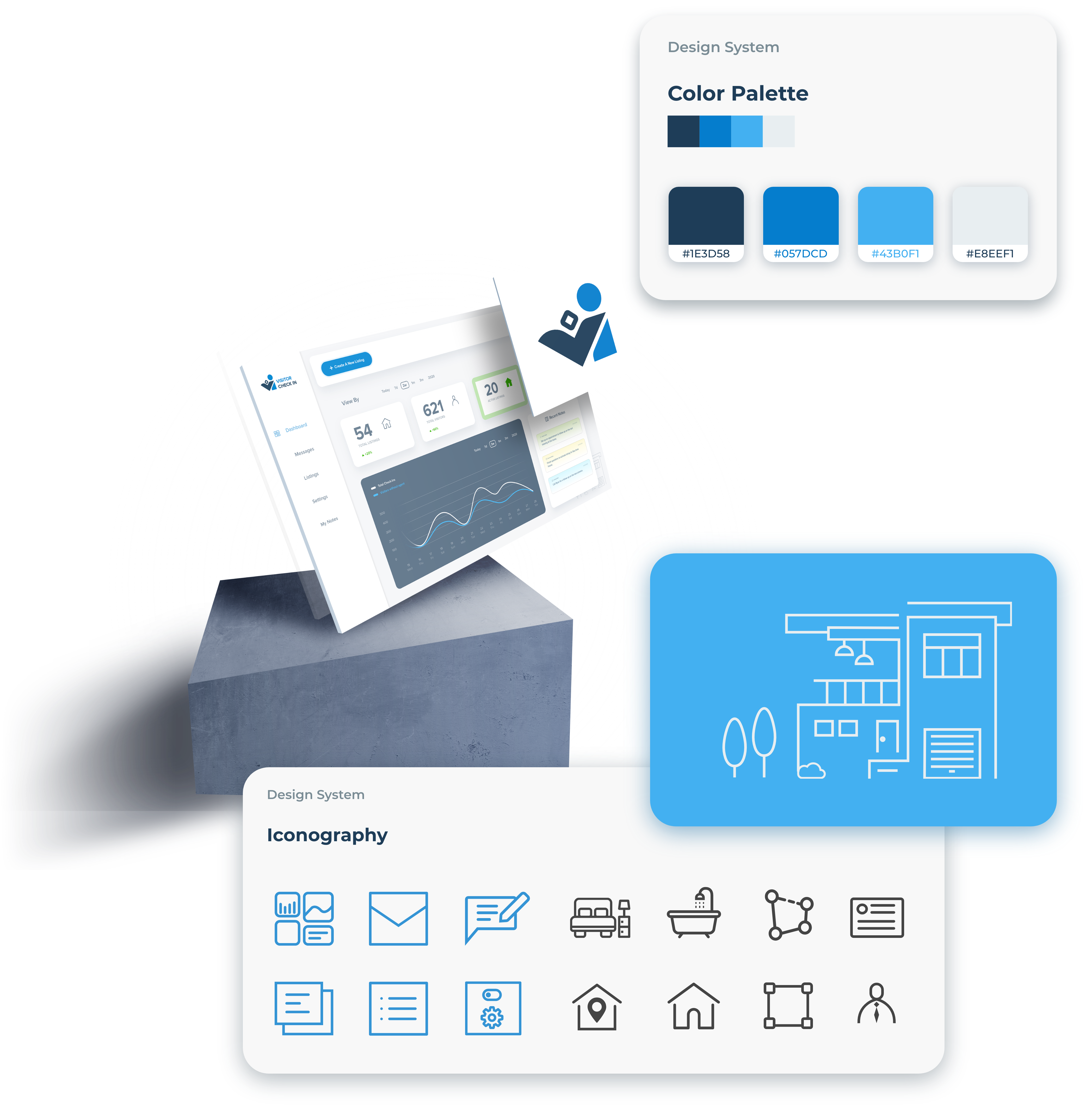
When picking the colors for the logo and the app, I choose a Monochromatic color palete to create focus and support legibility. Shade of a royal blue was the primary color choice, while an offwhite color was choosen as an accent color to tone down the blue in some areas while maintianing the balance for layouts it also helped creating less fatigue on the eyes.
Achieved
According to color psychology, blue is associated with trustworthiness and reliability, and this helped create more trust in the visitor when checking in using the app.
Logo Process
Sketching
To brain storm i began sketching some ideas and decided to use the letter "Vi" to create a mark.
Mood Board
Upon searching online for photos of people using an ipad, I found that there was a common way people held a tablet in their hands, which also intrestingly resembled the letter "vi"

Final Brand Mark
Typography, Buttons and other App Elements

App Icons

User Personas

Competitive Research

App Wireframing
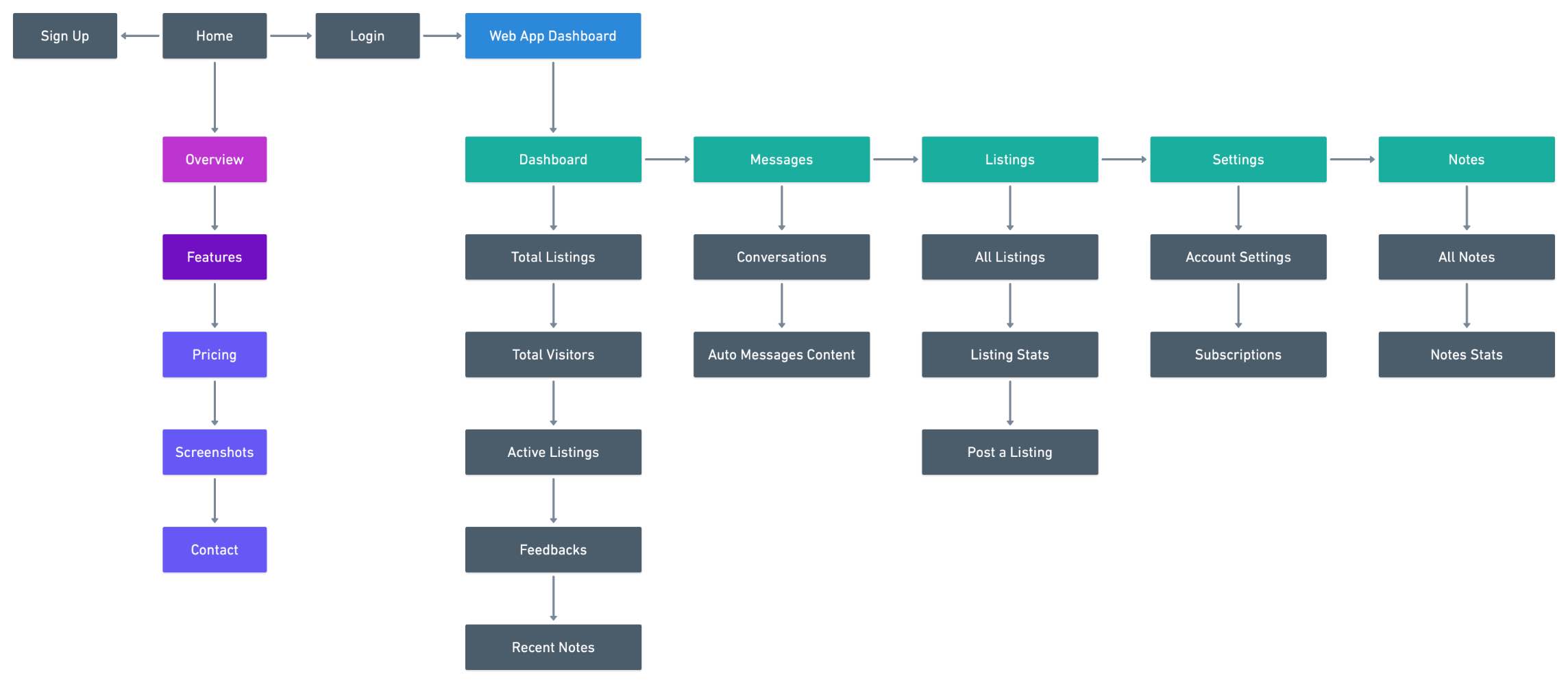
Site Map
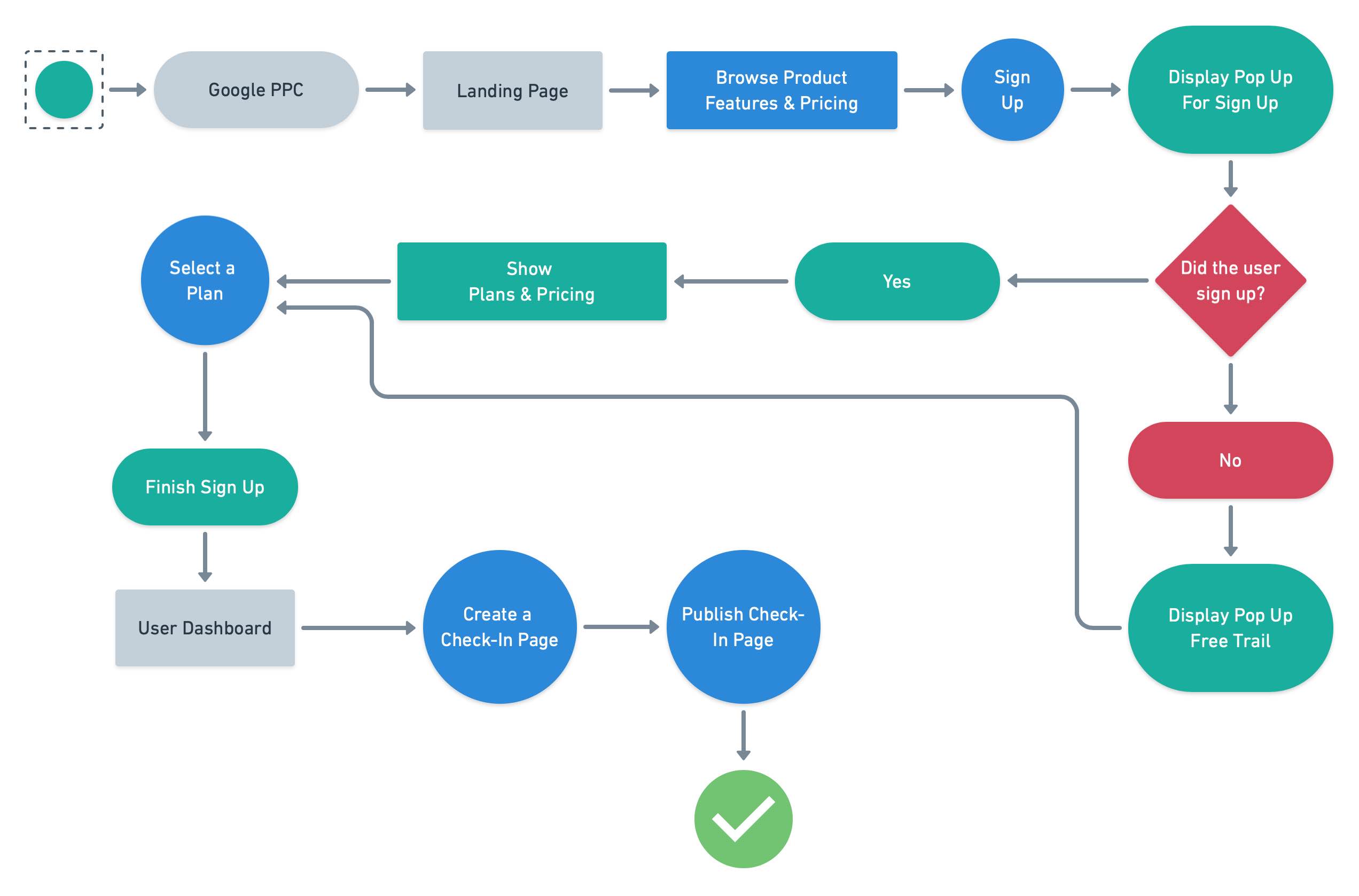
UserFlow
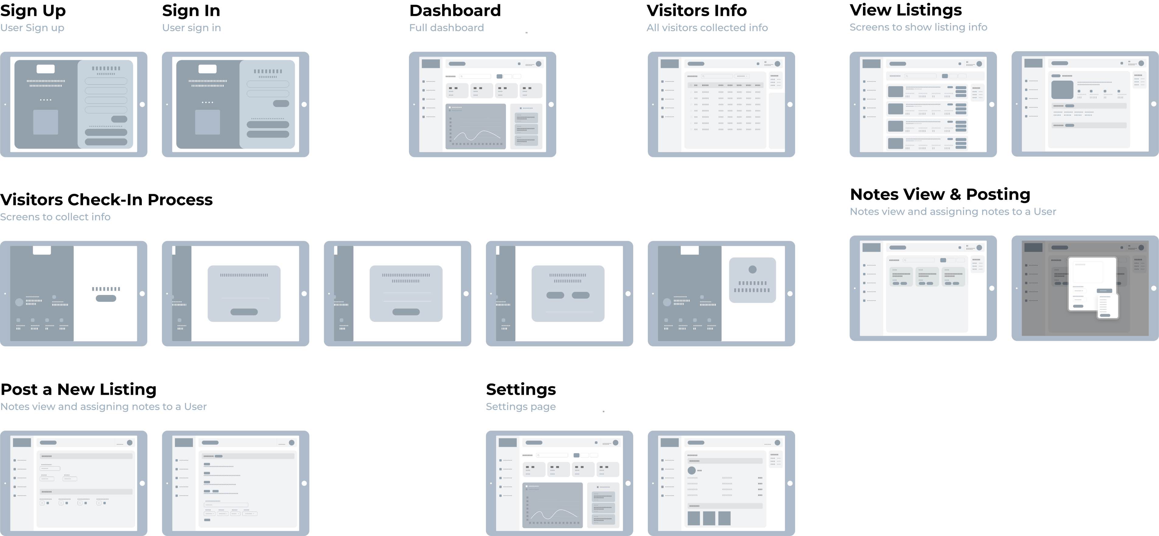
App Design
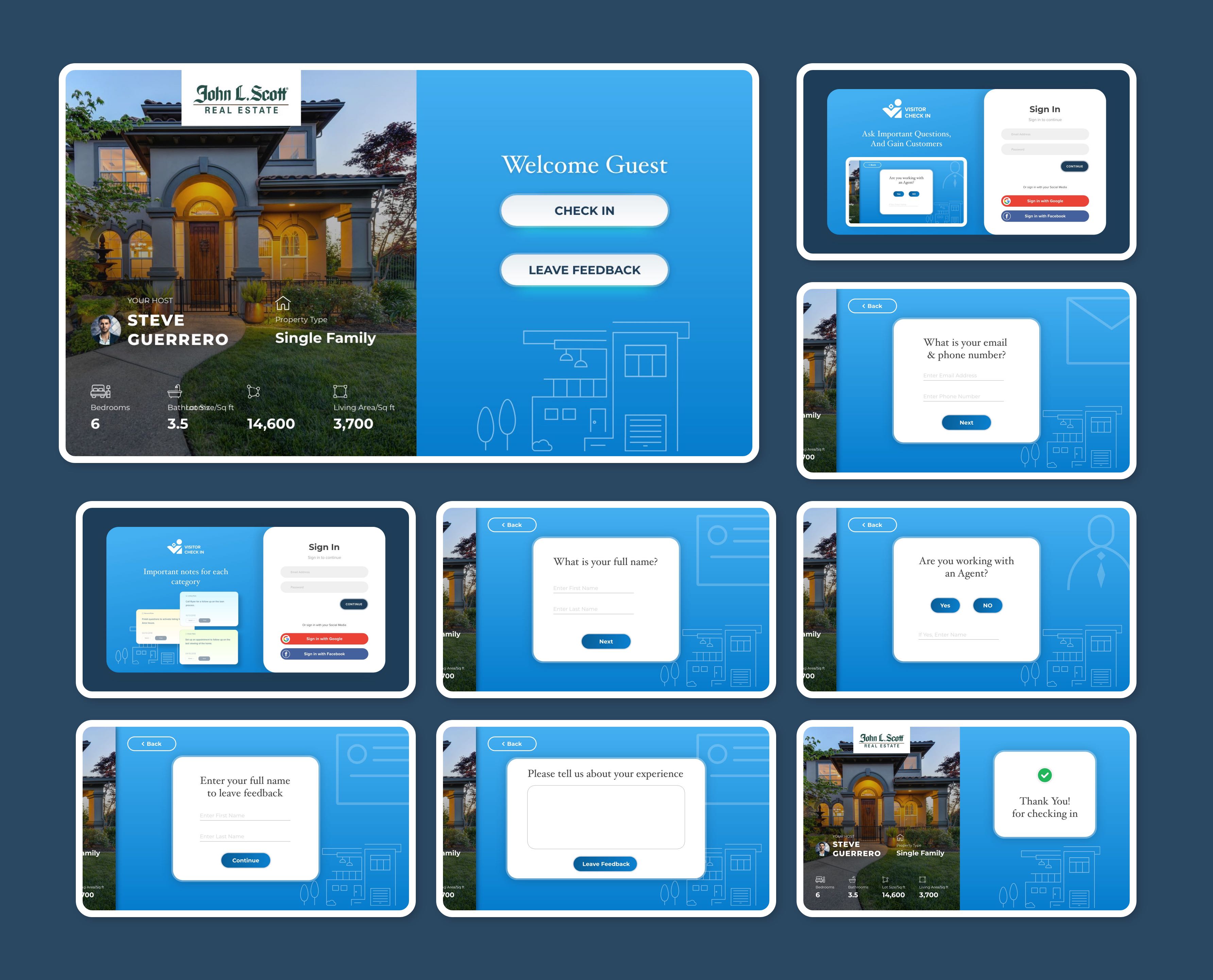
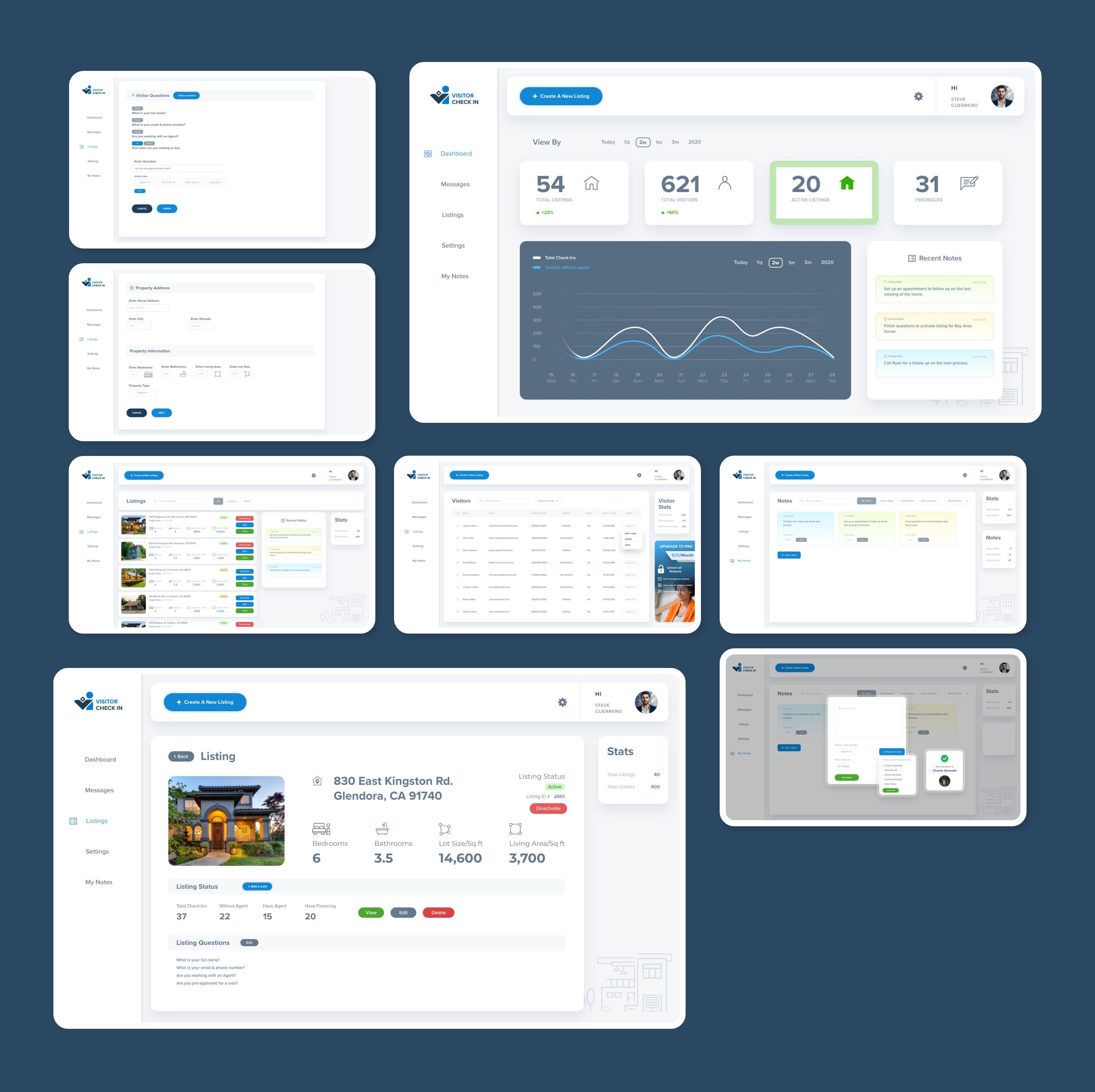
Screenshots of the On Boarding process, Visitors check-in process, and app functionality.